How to create a Lesson using the Picture Slider Component?
You can place a simple picture slider in your lessons using this component. You can also include a heading and sub-heading as descriptions for each slide
When to use this Component
You can use this component to display a collection of pictures as a slide show in the lesson. Users can easily understand the pictures by heading and sub-heading descriptions in each slide.
How it works
- The Picture Slider woks just like a carousel. You can configure it easily if you imagine it as a carousel.
- A picture appears in each slide.
- When the user hovers the mouse with a header and short explanation text appear for the relevant picture.
Features of this Component
• The heading and description text are optional.
• You can add as many as images in a slider.
• You can set rotation method of the picture slider.
• You can enable pagination for the slides.
You can create a page using this component by following the below steps.
Step 1: Go to the required Slide
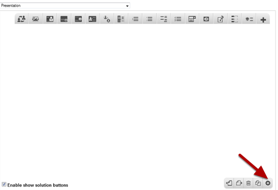
If you are creating a new Presentation, you will be taken to the first slide where you can use this component and create a page. Alternatively, if you want to add a new slide where you want to use this component, click on the '+' icon on the lower right corner as shown in the above image.
Step 2: Click on the Picture Slider Component Icon
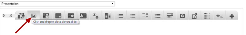
Then click on the Picture Slider component icon as shown in the above image. You will see a screen similar to the image shown below.
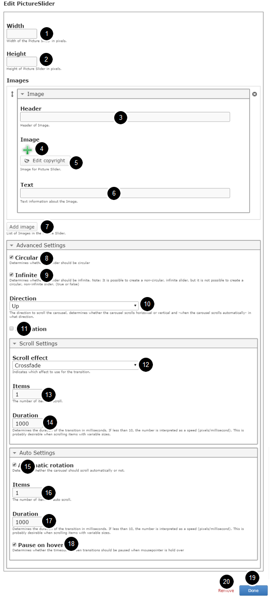
On this screen, you can
• Set the dimensions of the picture slider in pixels in the Width [1] and Height [2] fields.
• Add an optional header for the image by typing it in the Header [3] field under the Images title.
• Add an image using the ‘+‘ [4] icon and edit the copyright details of the image by clicking the Edit Copyright [5] button.
• Add a short description text about the image in the Text [6] field.
• Add more images to the slider by clicking the Add image [7] button.
• Click the Circular [8] checkbox under the Advanced Settings title if you want to make the slider circular.
• Click the Infinite [9] checkbox if you want to make the slider infinite.
• Set the scrolling direction of the slider to horizontal or vertical using the Direction [10] drop down.
• Check the Pagination [11] check box to show pagination under the slider.
• Set the scrolling effects for the transition using the Scroll effect [12] drop down menu under the Scroll Settings title.
• Set the number of items to scroll by typing the value in the Items [13] field.
• Set the duration of the transition by typing the value in the Duration field [14].
• Enable the automatic rotation by clicking the Automatic Rotation [15] checkbox.
• Set the number of items to scroll by typing the value in the Items [16] field under Auto Settings option.
• Set the duration of the transition by typing it in the Duration [17] field.
• Pause the slide show when you hover the mouse by clicking the Pause on hover [18] checkbox
• Click on the Done [19] button to save the changes.
• Click on the Remove [20] link to remove the component from the page.
Step 3: Define the Dimensions of the Slider
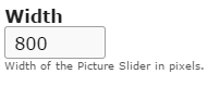
Type the width of the Picture Slider in pixels on the Width field as shown in the above image. This field is mandatory, and you must type a value on it.
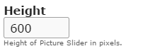
Then, type the height of the Picture Slider in pixels on the Height field as shown in the above image. This field also is mandatory.
Step 4: Add an Image Header (Optional)
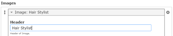
Type the header of the image on the Header field as shown in the above image. This field is not mandatory, and if you don't enter a title, it won't be shown as an empty space on the page
Step 5: Add an Image
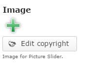
You can add an image to the page by clicking the '+' icon as shown in the above image. You will choose an image file as shown in the below image.
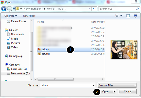
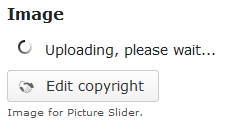
On the above screen, select the required image [1] and click the Open [2] button. You can see image being uploaded as shown in the below image.
Once the image has been uploaded, it will be shown under the Image title as shown [1] in the below image.
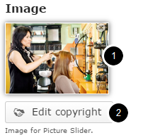
Optionally, you can update the copyright details of the uploaded image by clicking the Edit copyright [2] button shown above. Once you click the button, you will see the below screen.
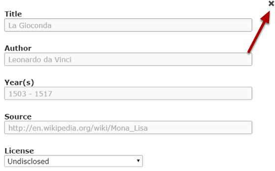
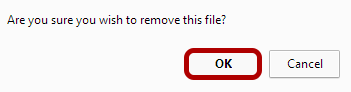
You can enter the image's copyright details on the above screen and click the Close button to update it. You can remove the uploaded image by clicking on the Remove file button shown on the below image.
You will be prompted to remove the image as shown in the below image. Click OK to confirm and remove the image.
You can also update the image without removing it by clicking on the image. You will be offered to select the image again as mentioned in step 5.
Step 6: Add Text information (Optional)
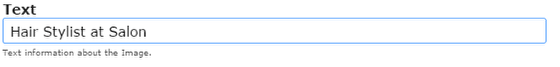
Type a short description text about the image on the Text field as shown in the above image. This field is not mandatory.
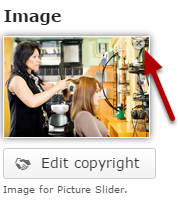
You can see the added image as shown in the below image.
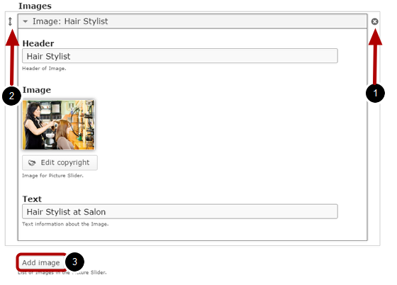
By default, there are only one image available at the beginning. If you want to add another one, click the Add Image [3] button below the currently available options as shown in the above image.
Another image will be added after you click the Add Image button. You can remove any answer by clicking the X [1] button on the top right corner of the Option window. You can also change the order of the answers by dragging the Double Headed Arrow [2] button on the top left corner of the Option window. Similarly, you can add as many images as you want.
Step 7: Edit Advanced Settings
You can set the Scroll and Auto Settings options under the Advanced Settings option. Click on the arrow button shown above to view the settings. You will see the below screen.
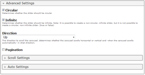
On the above screen, you can edit the advanced settings for the picture slider shown below.
Step 8: Circular Option (Optional)
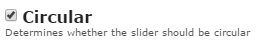
With this option, you can determine whether the slider should be circular or not by checking the Circular checkbox shown above. This option is optional, and so tick the checkbox if you need so. By default, it is enabled.
Step 9: Enable Infinite Option (Optional)
If you click Circular checkbox, you can determine whether the slider should be infinite or not by checking the Infinite checkbox shown above. This option is optional. By default, it is enabled.
Step 10: Set the Direction of the Slider
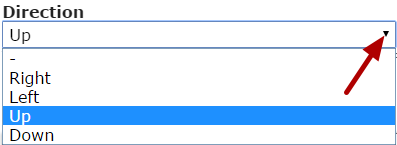
You can set the direction to scroll the carousel, determines whether the carousel scrolls horizontal or vertical and -when the carousel scrolls automatically- in what direction.
Clicks on the Direction drop down to select the scrolling direction such as Right, Left, Up and Down. It is set to Up by default.
Step 11: Enable Pagination (Optional)
Pagination is the sequence of numbers assigned to the slides in the picture slider. It can be seen as dots under the pictures.
By clicking the Pagination [1] checkbox shown above, you can enable the pagination for the picture slider. This option is optional. By default, it is unchecked.
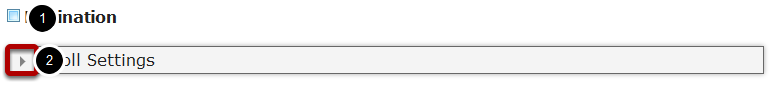
Step 12: Edit Scroll Settings
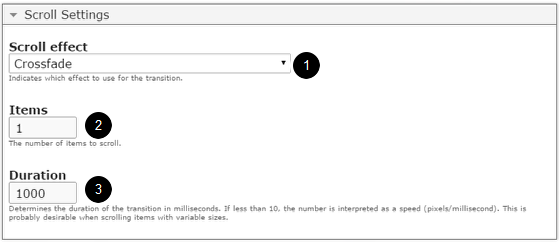
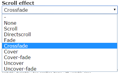
You can update the scroll settings of the picture slider by clicking the arrow button [2] on the Scroll Settings title as shown in step 11. You will see the above screen. On this screen you can set the scrolling effects for the slides under the Scroll effect [1] dropdown menu. The options available are:
- None
- Scroll
- Directscroll
- Fade
- Crossfade
- Cover
- Cover-fade
- Uncover
- Uncover-fade
By default, this setting is set to Crossfade. You can have a look at the available options of Scroll effect dropdown menu in the below screen.
You can also set the number of items you want to scroll for each transition in the Items [2] field. The pictures between these slides will be skipped. Type the number of milliseconds in the Duration [3] text field to set the duration of the transition as shown in step 12. If less than 10, the number is interpreted as a speed (pixels/millisecond). This is probably desirable when scrolling items with variable sizes.
Step 13: Edit Auto Settings
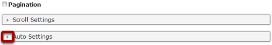
You can enable the auto settings by clicking the arrow button with Auto Settings title as shown in the above image. You will see the below screen.
On this screen, you can
-
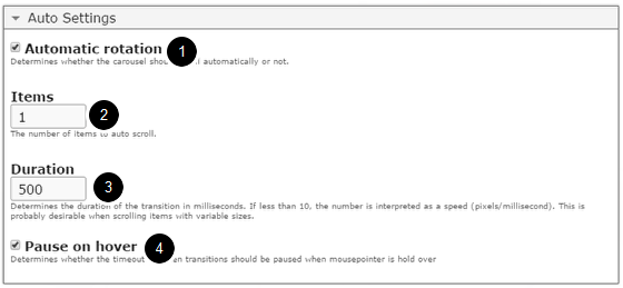
Enable automatic rotation by checking the Automatic rotation [1] checkbox. This option is optional. By default it is enabled.
-
Set the number of items you want to scroll for each transition in the Items [2] field.
-
Type the number of milliseconds in the Duration [3] text field to set the duration of the transition. If less than 10, the number is interpreted as a speed (pixels/millisecond). This is probably desirable when scrolling items with variable sizes.
-
Determines whether the timeout between transitions should be paused when mouse pointer is hold over by checking the Pause on hover [4] checkbox. This option is enabled by default.
Step 14: Click the Done Button
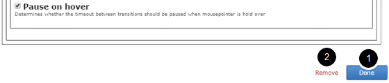
Once you've updated all the details, click the Done [1] button shown above to complete editing the page. You can cancel creating the page just by clicking the Remove [2] link shown above. If you click the Done button, you will see the below screen with a preview of the created page.
Step 15: Click the Create Button
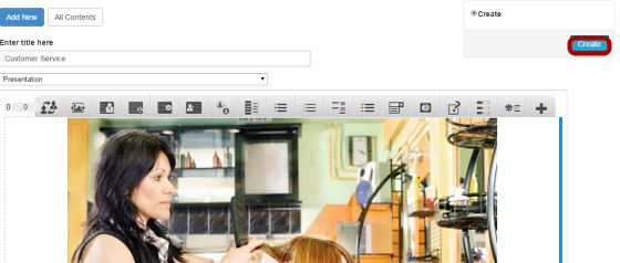
If you still want to edit the page, just double click on the preview page, and you will be taken to the Edit page. If you've done all the changes, you can click the Create button as shown above picture to finish editing the page.

You can see the finished page as shown in the above image.
Notes
-
You can create as many pages as possible in a Presentation using this component.
-
To avoid any issues with the pictures stretching skewing, it is advised to add pictures of the same dimensions and set the dimensions of the slider to the same values.
-
If you want to create a picture slider with landscape images, please avoid any portrait images to this picture slider, because these vertical images will be stretched and skewed to fit the full slide.
-
You can upload thumbnail images in .jpeg, .png and .gif formats only.